Polling suffered yet another humiliating ‘black eye’ in 2020. Yet again, when it came to predicting the presidential election in many of the most critical swing states, the polls missed the mark. Bigly. In particular, the NYT/Sienna College poll had Biden at almost a 11% margin in Wisconsin over Donald Trump. In reality, Biden won the state by less than a percentage point.
What went so wrong this time? And could anything have been done to avoid such a misfire for the second election in a row? The official postmortem analyses are not yet complete, but in the spirit of this blog, I wanted to see what could be surmised through publicly available data alone. There are obviously limits to what we can know without talking to the polling organizations themselves, but there are still a few takeaways—including the fact that there is probably no easy fix.
What Went Wrong? More Like Where Went Wrong
As a starting point, it’s helpful to visualize where in Wisconsin the NYT/Sienna poll was the most inaccurate. However, it’s also useful to consider how costly those errors were in terms of arriving at a final, off-target prediction. By that, I mean that I want to weigh the vote margin error by the number of votes in any given locality. We know that actual election results are tallied on a county by county basis. Polls, however, are not—which makes sense because polling each county would likely be too expensive. So the NYT/Sienna broke the state up into regions and sampled from those instead.
The problem with the NYT/Sienna poll regions (at least to us outsiders) is that the publicly available cross-tabs don’t tell you what the boundaries between the different regions are. Some of the regions are easy to match—like Milwaukee City or Milwaukee Suburbs. But others are a tougher call, like the “North” region or “West” region of the state. What does one do with a county that is in the northwest part of the state? In the end, guesses had to be made, though I relied a fair bit on this article from the Washington Post that breaks down the different regions of Wisconsin’s political map.
In the map below, the actual vote totals for Trump or Biden are compared to the predicted vote totals in that county’s corresponding NYT/Sienna poll region (or my best guess). As polling error was caused by both over-prediction of votes for Biden and under-prediction of votes for Trump, we must consider the prediction error for both candidates in constructing an overall error metric. To that end, I add together the absolute values of the prediction error for the two candidates in each county. The result is a heat map that shows where the NYT/Sienna poll predicted the most votes incorrectly.
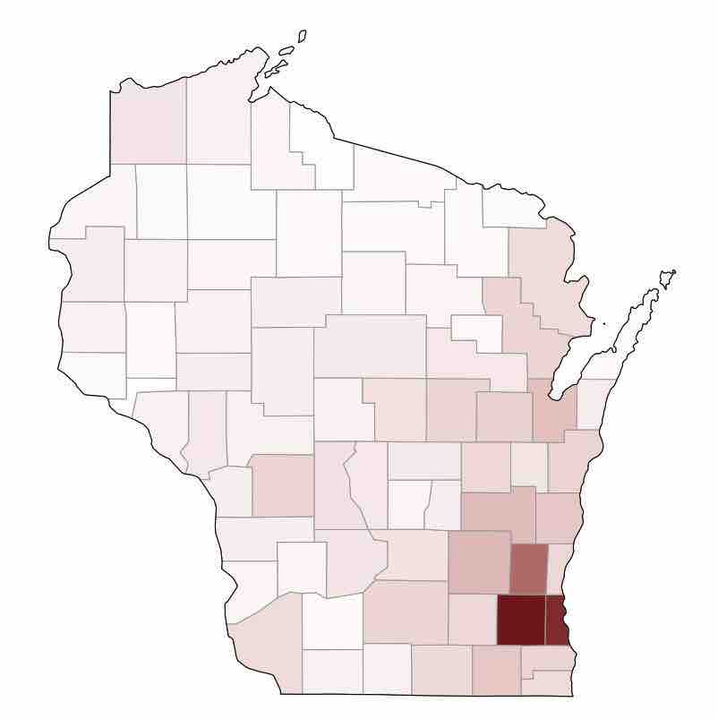
As you can see on the map, three counties stand out the most. And in case your Wisconsin geography is a bit rusty, those three are: the City of Milwaukee, Waukesha, and Washington. I’m pretty sure I matched those regions correctly because they fit very easily into one of two regions from the NYT/Sienna poll: a) the City of Milwaukee or b) the surrounding suburbs.
How Hard Would It Have Been to Get it Right?
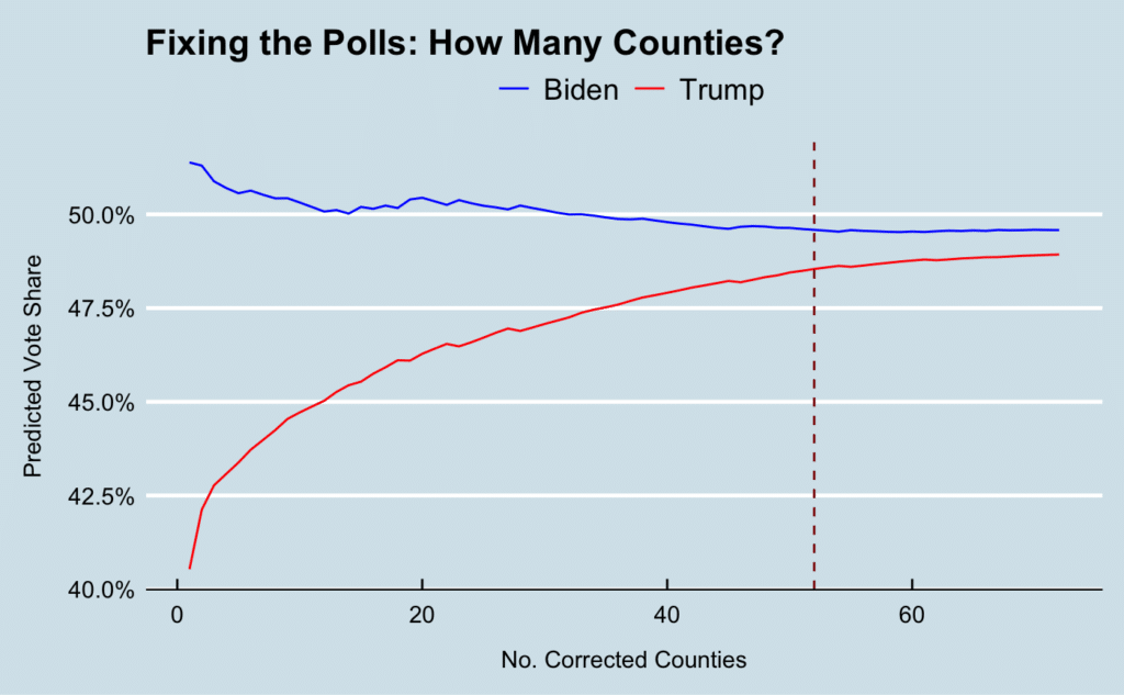
Ultimately, the heat map might prove a bit misleading, because it might make you think that things would have been fine if the NYT/Sienna poll had gotten things right in just a few places. In reality, the error was more systematic across the entire state. Even if you were to correct the error, county by county, going in the order of biggest fish first, you would still need to fix the error in at least 52 of the counties to bring the predicted votes within a percentage point of each other—where things ultimately landed on election day. That is over 70% of all the counties in the state.
In other words, all the pink-colored counties in the heat map eventually add up to a lot of error. Some of those counties may have mislabeled regions due to error on my part, but chances are that no matter how you slice or dice them, a proper poll to get decent coverage across the entire state would not have been a trivial investment of either time or resources.
Could Anything Have Been Done Differently?
One thing that’s evident from the dual line graph—specifically from the steeper curve of the red line—is that underestimating support for Trump was a bigger problem than overestimating support for Biden. In Milwaukee in particular, the NYT/Sienna poll put Trump’s support at 18% when the actual number turned out to be 29.4% on election day.
If the “shy Trump voter” phenomenon was an anticipated element going into the election, couldn’t they have seen this coming? It appears the NYT/Sienna folks did have access to one piece of data that could have told them whether they were a) measuring a real shift in public opinion, or b) just missing these shy Trump voters. That piece of data? The way people said they voted in 2016.
The publicly available data doesn’t show the breakdown of 2016 Trump support by region or by county; they only have an aggregate number for all of Wisconsin. Still, if they asked that question to every survey respondent, then they could have easily calculated county-level 2016 Trump support and checked, for example, whether the level of professed Trump support in 2016 among Milwaukee survey respondents was roughly around 28.5%—the share of Milwaukee’s votes that Trump took home in the 2016 election (source). If that didn’t match up, it would have been a red flag that they were not putting together a representative sample.
Guess what? Polling is hard
Ultimately, I don’t pretend that the job of polling is easy. If shy Trump voters were shy even about their past support for Trump, then that early warning system I outlined wouldn’t be very effective. And as we’ve seen, even if they had corrected for the underestimation of Trump support in Milwaukee and its surrounding suburbs, it would not have been the silver bullet to make the polls perfect. One thing’s for sure: with misfires on two elections in a row, it’s going to be a while before people ever trust polls again. But regardless, it behooves the pollsters to understand how exactly things went so wrong for the second time in a row—if only for the sake of science. I’m sure they’re already doing that. And if one of those people is you, can you share your data with me?